Introduction to stat in R: Cheatsheet
A cheatsheet to find your way around your stats
Content
Introduction
The slides of this lecture can be find here
Stepwise analyses
Check your data
Build your hypothesis
Build your model
Check your model fit. Are the statistical assumptions met?
No, data transformation and corrections
Yes, extract your results
1. Check your data
1.1. Load your data
How to load your data in “df”:
.csv file
df = read.csv(file = 'name-of-your-file.csv').txt file
df = read.delim(file = 'name-of-your-file.txt').xlsx file (Excel files also with xls)
library(readxl)

df = read_xlsx(path = 'name-of-your-file.xlsx', sheet = 'name of the sheet')
1.2. Your dataset structure
Look at your dataframe:
View(df)Explore the structure:
str(df)## 'data.frame': 180 obs. of 6 variables:
## $ TSP : chr "1-E34" "10-G17" "100-Q21" "101-Q21" ...
## $ C.loss_Mi1 : num 88.3 56.9 86.8 59.4 59.1 ...
## $ N.loss_Mi1 : num 96 55 84.1 58.7 68.3 ...
## $ lit.rich : int 1 1 2 1 1 2 1 1 2 2 ...
## $ neigh.sp.rich: int 1 1 2 2 2 2 3 1 2 2 ...
## $ fall : num 74 21.8 72 38.2 66.1 ...1.3. Your data structure
1.3.1. Plot all the variables
plot(df)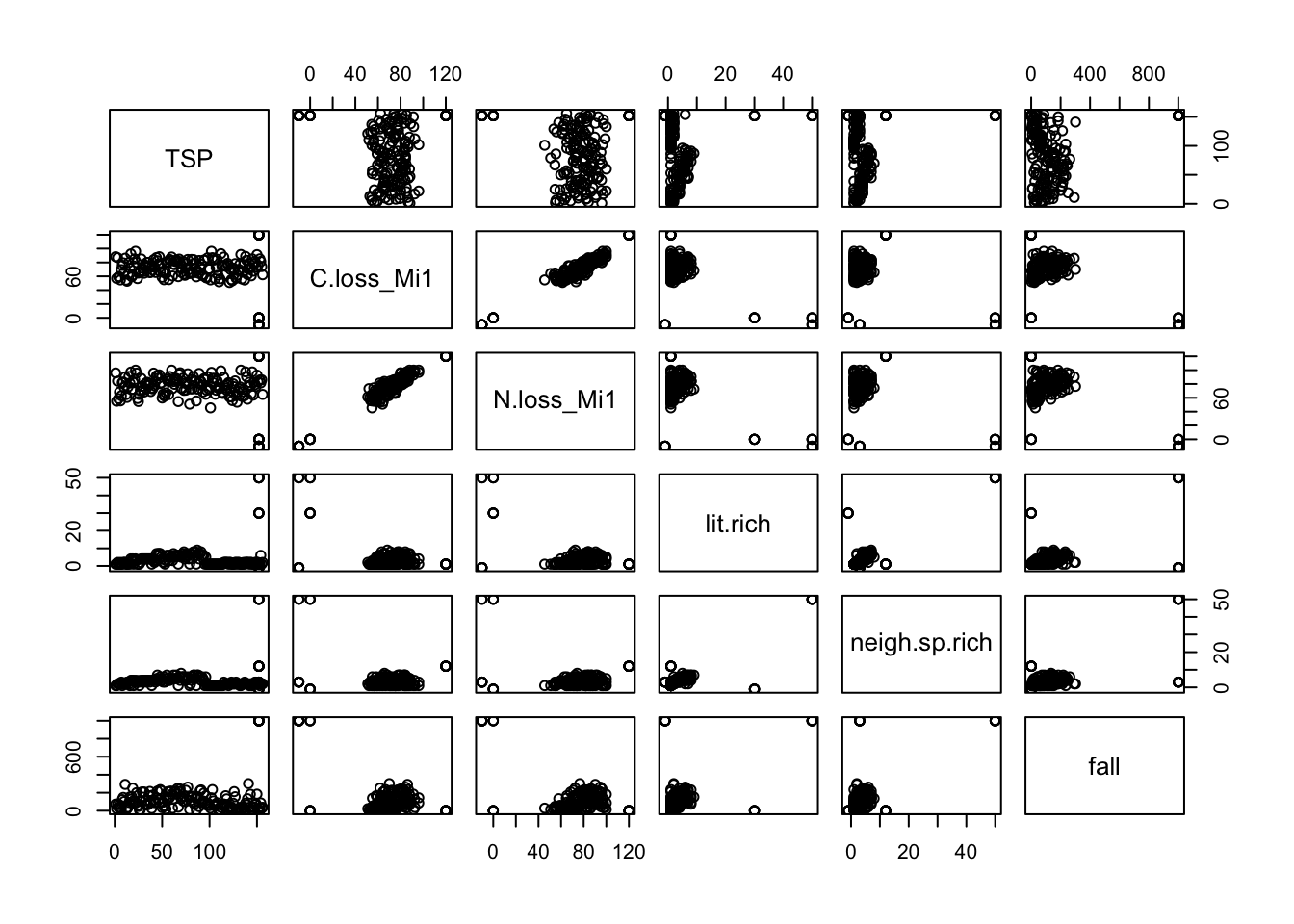
1.3.2. Plot the variables’ distribution
Example with C loss during decomposition (“C.loss_Mi1”)
boxplot(df$C.loss_Mi1)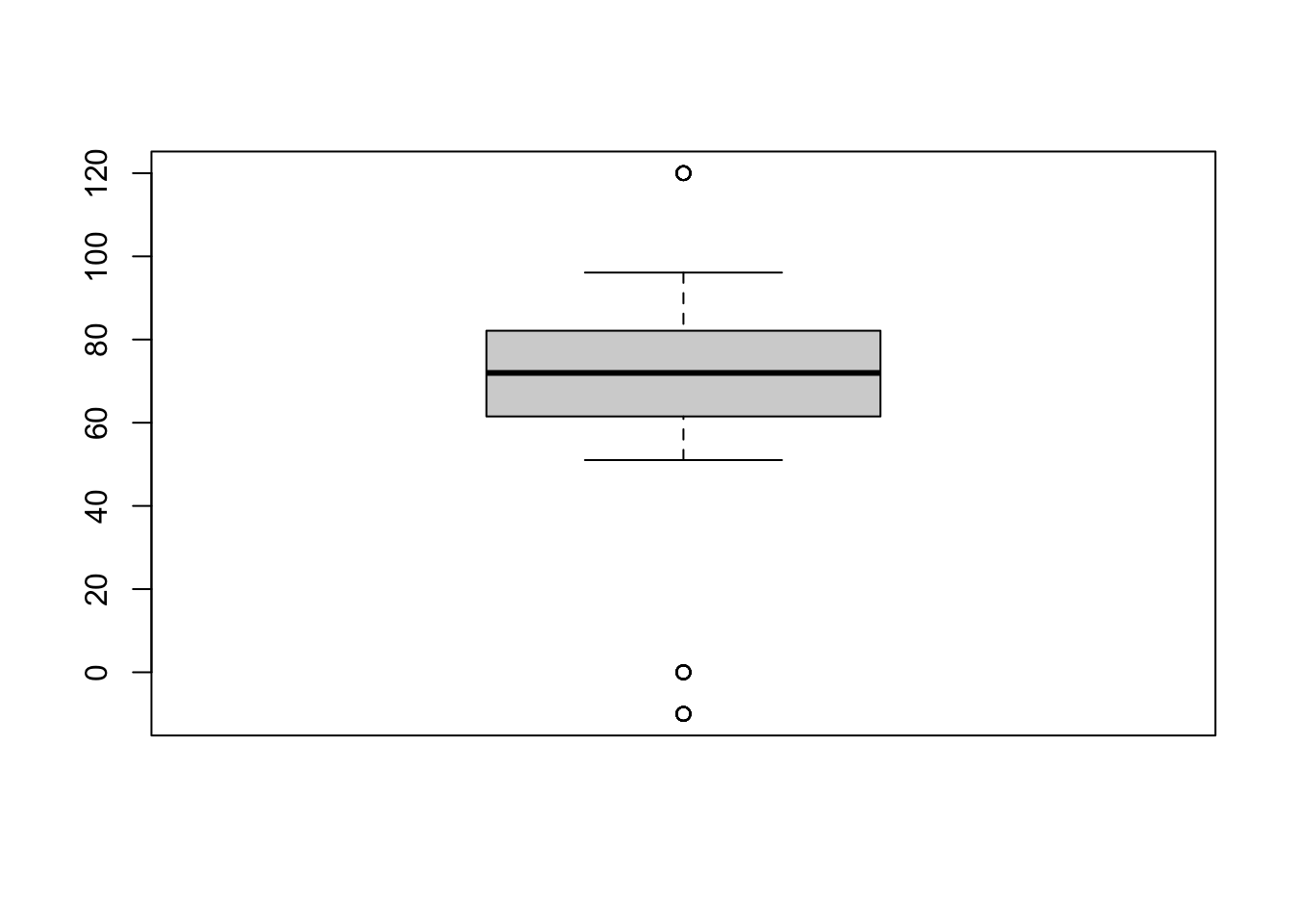
ggplot2 version
library(ggplot2)

ggplot(data = df, aes(y = C.loss_Mi1, x = " ")) + # structure of the graph
  geom_boxplot() +                                # add the boxplot
  geom_jitter() +                                 # show the points distribution
  labs(x = '', y = "C loss [%]") +                # add labels to the axis
  theme_classic()                                 # make it pretty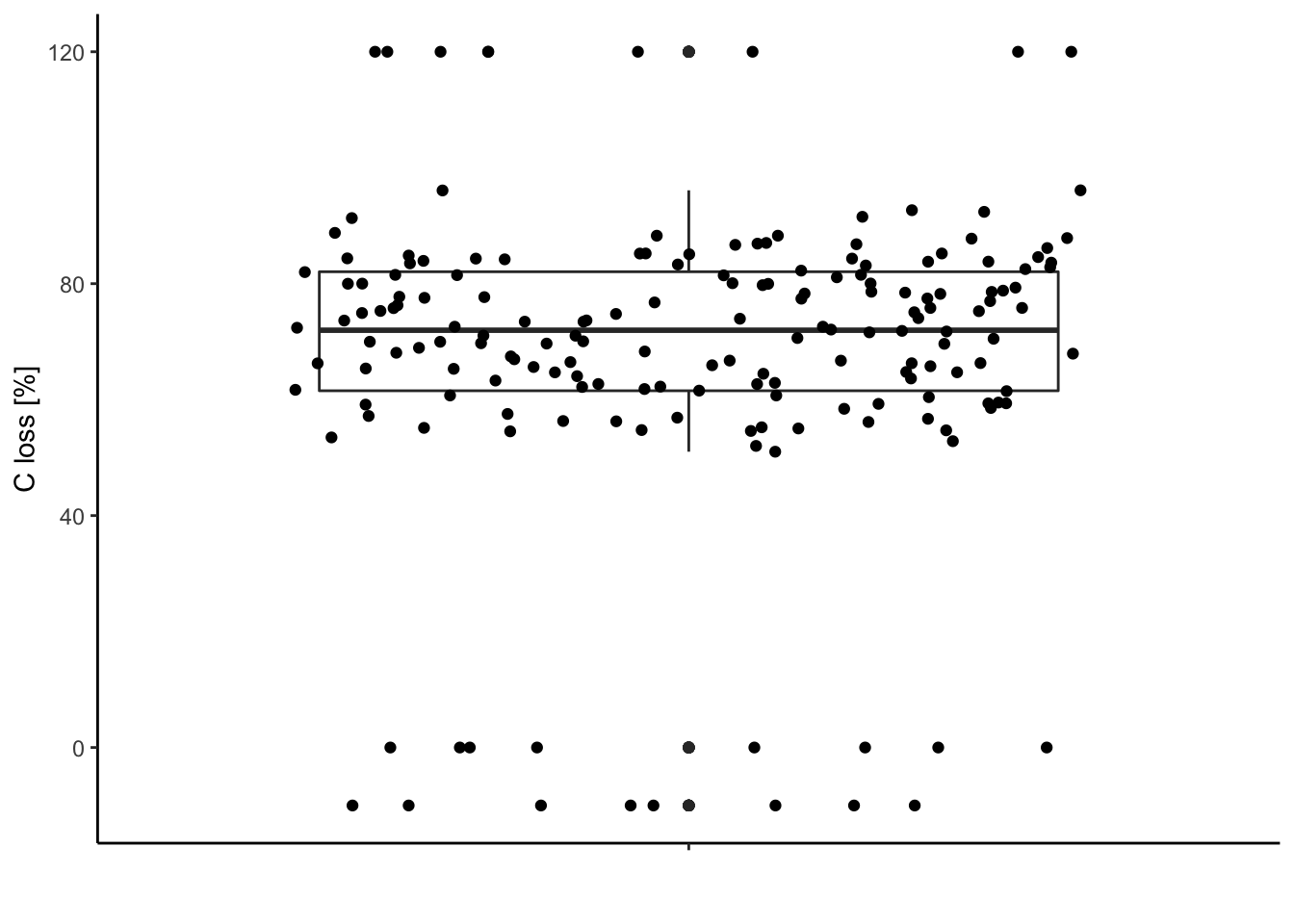
1.3.3. Compare this distribution to the possible range of data
The carbon loss (%) during litter decomposition should be above 0% (intact leaves) and below 100% (completely decomposed).
Check for data out of the range (possible typos, mistakes during measurements …).
Visually:
ggplot(data = df, aes(y = C.loss_Mi1, x = " ")) + # structure of the graph
  geom_boxplot() +                                # add the boxplot
  geom_jitter() +                                 # show the points distribution
  labs(x = '', y = "C loss [%]") +                # add labels to the axis
  theme_classic() +                               # make it pretty
  geom_hline(yintercept = 0) +                    # add line at 0%
geom_hline(yintercept = 100) # add line at 100% 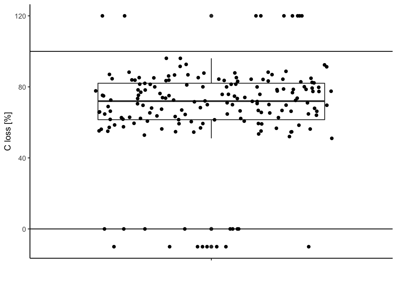
Extract these outliers:
df[df$C.loss_Mi1 < 0 | df$C.loss_Mi1 > 100,] # | means "OR"## TSP C.loss_Mi1 N.loss_Mi1 lit.rich neigh.sp.rich fall
## 156 outliers 120 120 1 12 1
## 157 outliers 120 120 1 12 1
## 158 outliers 120 120 1 12 1
## 159 outliers 120 120 1 12 1
## 160 outliers 120 120 1 12 1
## 161 outliers 120 120 1 12 1
## 162 outliers 120 120 1 12 1
## 163 outliers 120 120 1 12 1
## 164 outliers 120 120 1 12 1
## 173 outliers -10 -10 50 50 1000
## 174 outliers -10 -10 50 50 1000
## 175 outliers -10 -10 -1 3 1000
## 176 outliers -10 -10 -1 3 1000
## 177 outliers -10 -10 -1 3 1000
## 178 outliers -10 -10 -1 3 1000
## 179 outliers -10 -10 -1 3 1000
## 180 outliers -10 -10 -1 3 1000With dplyr:
library(dplyr)

df %>%
  filter(C.loss_Mi1 < 0 | C.loss_Mi1 > 100) # filter your rows under conditions
## TSP C.loss_Mi1 N.loss_Mi1 lit.rich neigh.sp.rich fall
## 1 outliers 120 120 1 12 1
## 2 outliers 120 120 1 12 1
## 3 outliers 120 120 1 12 1
## 4 outliers 120 120 1 12 1
## 5 outliers 120 120 1 12 1
## 6 outliers 120 120 1 12 1
## 7 outliers 120 120 1 12 1
## 8 outliers 120 120 1 12 1
## 9 outliers 120 120 1 12 1
## 10 outliers -10 -10 50 50 1000
## 11 outliers -10 -10 50 50 1000
## 12 outliers -10 -10 -1 3 1000
## 13 outliers -10 -10 -1 3 1000
## 14 outliers -10 -10 -1 3 1000
## 15 outliers -10 -10 -1 3 1000
## 16 outliers -10 -10 -1 3 1000
## 17 outliers -10 -10 -1 3 10001.3.4. Clean your dataset
You can inverse the condition and save the selected rows in df. Be careful, this will overwrite your data frame (in R), it is always wise to have a save copy.
df.save = df # save the data before cleaning in df.save

df =
  df %>%
  filter(!(C.loss_Mi1 < 0 | C.loss_Mi1 > 100)) # "!" inverse the conditions
Alternatives:
df =
  df %>%
  filter(C.loss_Mi1 >= 0 & C.loss_Mi1 <= 100)        # "&" both conditions needed

df = df[df$C.loss_Mi1 >= 0 & df$C.loss_Mi1 <= 100, ] # in base R
Data after cleaning:
ggplot(data = df, aes(y = C.loss_Mi1, x = " ")) + # structure of the graph
  geom_boxplot() +                                # add the boxplot
  geom_jitter() +                                 # show the points distribution
  labs(x = '', y = "C loss [%]") +                # add labels to the axis
  theme_classic() +                               # make it pretty
  geom_hline(yintercept = 0) +                    # add line at 0%
geom_hline(yintercept = 100) # add line at 100% 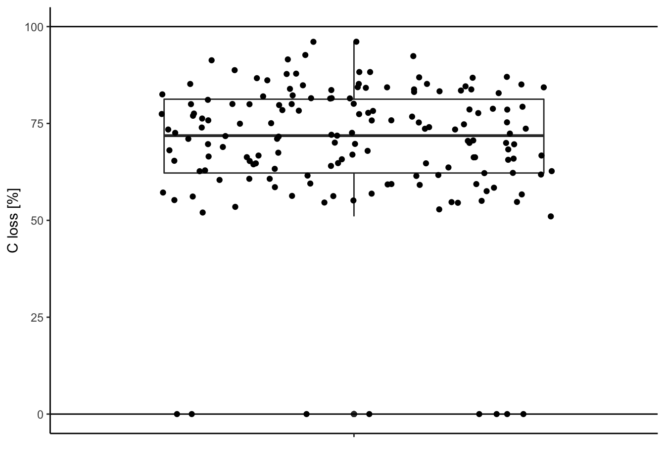
Looks better, no?!
2. Build your hypotheses
2.1. Hypotheses
This as nothing to do with R. In our case:
We expect carbon loss (C.loss_Mi1) to increase with litter species richness (lit.rich).
2.2. distribution
What is the expected distribution of the response variable C.loss?
In short:
| Distribution | Sampling | Example |
|---|---|---|
| Normal | Continuous measurements | size, flux, biomass … |
| Poisson | Discrete counting | number of species, number of individuals |
| Binomial | Yes/No | presence-absence of species |
| Beta | Percentages | decomposition rate |
| … |
N.B. the beta distribution takes into account the bounding between 0 and 1 (or 0 and 100). In our case where our variable values are far from these limits, the normal distribution can also be used and will give similar results.
3. Build your model
3.1. Identify the parameters of your model
Response variable: C.loss_Mi1
Explanatory variable: lit.rich
Formula: C.loss_Mi1 ~ lit.rich
Relation type: linear
Data frame: df
Distribution of the residuals: Normal
3.2. Fit your model on your data
mod = lm(data = df, formula = 'C.loss_Mi1 ~ lit.rich') # the lm function fit linear model with Normal distribution assumption on the residualsOther residual distribution type:
Poisson distribution
mod = glm(data = df, formula = 'y ~ x', family = poisson())Binomial distribution
mod = glm(data = df, formula = 'y ~ x', family = binomial())4. Check your model fit. Are the statistical assumption met?
New in town: the “performance” package
4.1. Model fit
library(performance)

check_model(mod)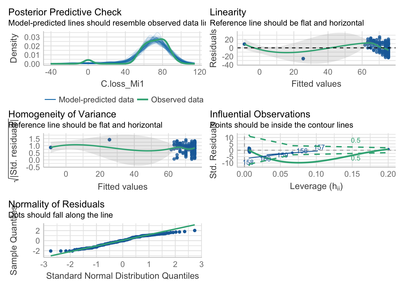
4.2. Check outliers
check_outliers(mod)## OK: No outliers detected.4.3. Check possible distribution of residuals
check_distribution(mod)## # Distribution of Model Family
##
## Predicted Distribution of Residuals
##
## Distribution Probability
## normal 66%
## tweedie 22%
## weibull 6%
##
## Predicted Distribution of Response
##
## Distribution Probability
## tweedie 59%
## neg. binomial (zero-infl.) 9%
## normal 9%4.4. Check normality of the residuals
check_normality(mod)## Warning: Non-normality of residuals detected (p = 0.002).4.5. Check heteroscedasticity of variance
check_heteroscedasticity(mod)## Warning: Heteroscedasticity (non-constant error variance) detected (p = 0.021).Remember that these tests are often really conservative. They are useful to make your choices but need to be considered having in mind the sample size and data structure.
Here, our model doesn’t seem to meet the assumption of heteroscedasticity and normality of the residuals.
5. No, data transformation and corrections
5.1. Check your data (again)
Look for surprising values, they could be typos.
ggplot(data = df, aes(y = C.loss_Mi1, x = " ")) + # structure of the graph
  geom_rect(data = NULL,                          # add rectangle to show outliers
            aes(ymin = -5, ymax = 5,
                xmin = -Inf, xmax = Inf),
            alpha = .005, fill = 'red', color = NA) +
  geom_boxplot() +                                # add the boxplot
  geom_jitter() +                                 # show the points distribution
  labs(x = '', y = "C loss [%]") +                # add labels to the axis
  theme_classic() +                               # make it pretty
  geom_hline(yintercept = 0) +                    # add line at 0%
geom_hline(yintercept = 100) # add line at 100% 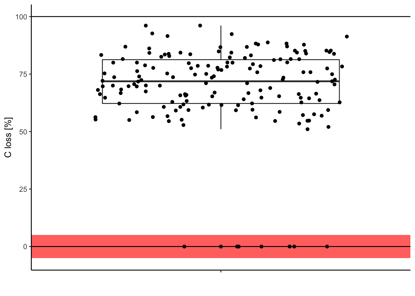
Is it meaningful to have 0% of carbon loss after one year of decomposition? In this case, it was only typos. So we can correct them in the original data.
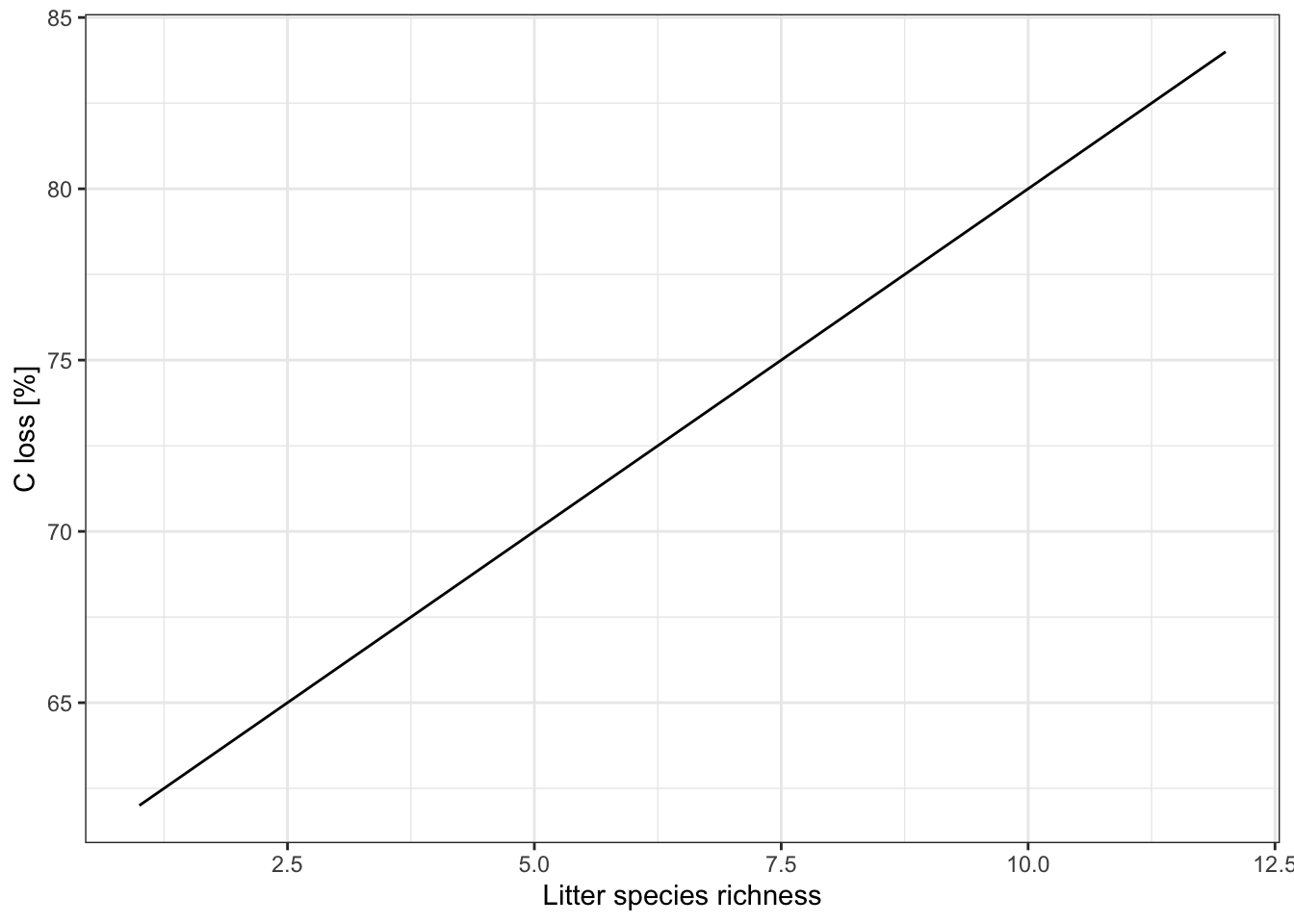
Look at the relationship you are fitting
ggplot(data = df, aes(x = lit.rich, y = C.loss_Mi1)) +
  geom_jitter() +
  # all the regression line using a linear relationship (i.e. here the same that your model)
  geom_smooth(method = 'lm', color = 'black') +
  labs(x = "Litter species richness", y = "C loss [%]") +
  theme_classic()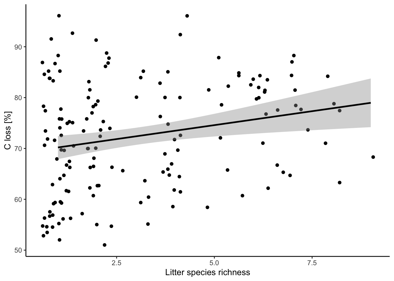
5.2. New model after corrections
mod = lm(data = df, formula = 'C.loss_Mi1 ~ lit.rich')
check_model(mod)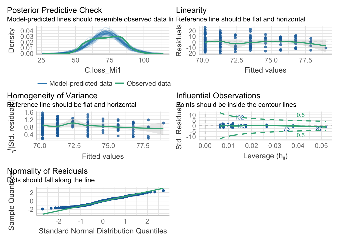
5.3. Data transformation
Log transformation of your explanatory variable.
ggplot(data = df, aes(x = lit.rich, y = C.loss_Mi1)) +
  geom_jitter() +
  # all the regression line using a linear relationship (i.e. here the same that your model)
  geom_smooth(method = 'lm', color = 'black') +
  scale_x_continuous(trans = 'log', breaks = c(1,2,4,8)) +
  labs(x = "Litter species richness", y = "C loss [%]") +
  theme_classic()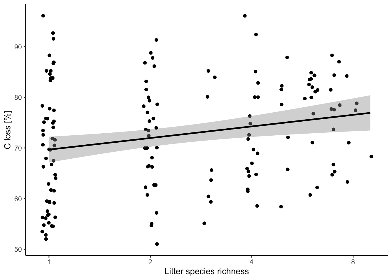
New model
mod.1 = lm(data = df, formula = 'C.loss_Mi1 ~ log(lit.rich)')

check_model(mod.1)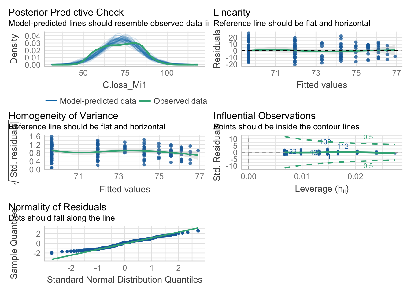
5.4. Compare the model quality
compare_performance(mod, mod.1)## # Comparison of Model Performance Indices
##
## Name | Model | AIC | AIC weights | BIC | BIC weights | R2 | R2 (adj.) | RMSE | Sigma
## -----------------------------------------------------------------------------------------------------
## mod | lm | 1176.469 | 0.484 | 1185.599 | 0.484 | 0.051 | 0.045 | 10.557 | 10.626
## mod.1 | lm | 1176.338 | 0.516 | 1185.469 | 0.516 | 0.052 | 0.046 | 10.552 | 10.621Data transformation doesn’t improve our model
6. Yes, extract your results
6.1. Check model summary
summary(mod)##
## Call:
## lm(formula = "C.loss_Mi1 ~ lit.rich", data = df)
##
## Residuals:
## Min 1Q Median 3Q Max
## -20.2747 -8.7829 0.8984 7.5652 25.9039
##
## Coefficients:
## Estimate Std. Error t value Pr(>|t|)
## (Intercept) 69.1002 1.4516 47.602 < 2e-16 ***
## lit.rich 1.0972 0.3824 2.869 0.00469 **
## ---
## Signif. codes: 0 '***' 0.001 '**' 0.01 '*' 0.05 '.' 0.1 ' ' 1
##
## Residual standard error: 10.63 on 153 degrees of freedom
## Multiple R-squared: 0.05107, Adjusted R-squared: 0.04487
## F-statistic: 8.234 on 1 and 153 DF, p-value: 0.0046936.2. Extract model coefficients
summary(mod)$coefficients## Estimate Std. Error t value Pr(>|t|)
## (Intercept) 69.100160 1.4516329 47.601675 1.272742e-93
## lit.rich 1.097198 0.3823676 2.869485 4.693330e-036.3. Extract model R squared
summary(mod)$r.squared## [1] 0.051068316.4. Extract your fitted model
library(ggeffects)

predictions = ggpredict(model = mod, terms = 'lit.rich')

predictions
## # Predicted values of C.loss_Mi1
##
## lit.rich | Predicted | 95% CI
## -------------------------------------
## 1 | 70.20 | [67.92, 72.48]
## 2 | 71.29 | [69.44, 73.15]
## 3 | 72.39 | [70.72, 74.07]
## 4 | 73.49 | [71.68, 75.30]
## 5 | 74.59 | [72.38, 76.80]
## 6 | 75.68 | [72.92, 78.44]
## 7 | 76.78 | [73.39, 80.17]
## 9 | 78.97 | [74.23, 83.72]6.5 Plot your results
ggplot(data = df, aes(x = lit.rich, y = C.loss_Mi1)) +         # frame
  geom_jitter(data = df, aes(x = lit.rich, y = C.loss_Mi1)) +  # jitter add some noise in the x-axis to better show the points
  geom_line(data = predictions, aes(x = x, y = predicted)) +   # add the regression line, when you use different dataframes in the plot you need to define them for each geom
  labs(x = "Litter species richness", y = "C loss [%]") +
  theme_classic()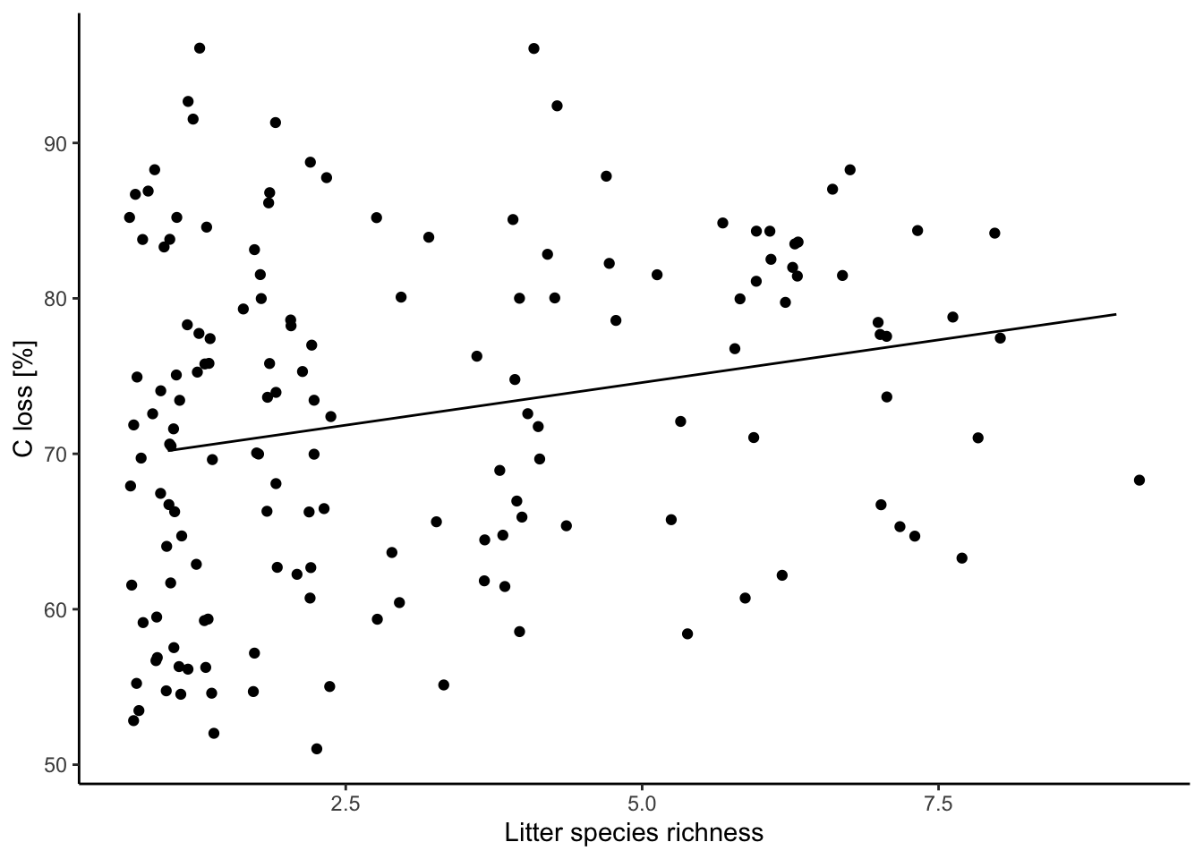
See ggplot packages for more details.
Useful links and tutorials
The R bible: The R Book
Data handling
Tidyverse world:
The tidyverse packages:
loading Excel data with readxl
loading data with readr package
data handling with dplyr package
Building statistical model
Variable distributions (visual example)
Linear model with normally distributed residuals:
Linear model with other residuals distribution:
Non-linear models:
General additive model: a great tutorial
Mixed effect models (using lm4):
nice visualization to understand the process behind Mixed-effect models
Structural Equation Modeling:
the Bible for SEM: Jon Lefcheck book
Spatio-temporal analyses with R:
A complete other world: Bayesian statistics:
lecture using Stan
Plotting stuff
ggplot make your life easy and pretty
ggpubr an Add-On to ggplot2:
Rémy Beugnon
I am a PosDoc between iDiv, the CEFE and LIM working biodiversity-microclimate-ecosystem functioning nexus.